Thursday, July 31, 2014

Kerstin Brätsch at Gavin Brown

Photo by Thomas Müller

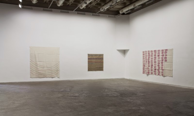
Since the patternal permutations are endless in indifference, little interest found in their production line marbles in interminable variation (though the PR does its job unpacking and assigning new roles to the symbolism.) Brätsch’s work never quite looking as good as their commodity packaging counterparts found on store shelves everywhere but still fine, its more about the curled paper tacked and temporary walls and mystic install.
Of course some collector is going to put them in a frame, but for now they look crappy and disheveled and good. Well it would be enjoyable to get in here in the A.C. and take a break.
But no one is ever going to believe in these surfaces, or get up close and just admire like the nebulousness of it all, man, the same spirituality found in patterned mandala of so many bolts of fabric, again inbetween production lines, like that Henning Bohl show at Casey Kaplan, or the sublime rot of Sigmar Polke. This is Gavin Brown afterall, the gallery who finds interest in the profound gap of meaning and enterprise in art.
Shio Kusaka at greengrassi

Shio Kusaka at greengrassi

I mean of course these look good. Great even. To roll one in your hands. All the bright desire of commodity souvenirs - their cute lovable simplicity, the love of refuse, the handmade, the cutsey irrelevance in a line. The tiny sculpture trick. The Richard Scary one of each kind trick.
The Artworld always has exactly one ceramist, and one could find a conspiracy in this with the passing of that other major clay-man, her emerging as he was passing into history. It’s a like a tenured position: The Artworld’s ceramist. Not that Kusaka isn’t good, but rather where are the others, there must be some, can’t just be one potter.

Wednesday, July 30, 2014

Isabelle Cornaro at Museum Leuven

Isabelle Cornaro at Museum Leuven

What a totally enjoyable video, a plethora of suspense laden vignettes the simplicity of which must leave Blockbuster directors gruff, all the slow anxiousness of classic horror films, in the psychotic tenor of claustrophobic 70’s psychadelia. The Blob all the more unbearable because of its inhuman candy color.
The rest of the work just can’t maintain the same tension in its formalness, all coming across as quite nice, fine actually, just pleasant objects to fill space, asking the banality of “what could they mean?”-style press release fodder, but maybe they're better in person, though Cornaro’s films always seem to do so much more than the objects, though what a tragedy of a place to install it.
Tom Burr at Franco Noero
Drunk Emily

Tom Burr at Franco Noero

Tom Burr owns the foppish gesture, regardless whether he birthed. Despite it’s cliche as “emblem of Contemporary Art,” Burr’s dramatized version is the best. The objects obtaining a cartoon caricature-esque quality, iPhone icons of contemporary art, somehow losing the sharp imperfection of real objects. The reckless arrangement attains a rigidness opposing the lesser artists' rigid attempts to feign recklessness. The starch pressed severity make the attenuation towards the diaristic details all the more fetishistically perverse and good.

Sunday, July 27, 2014

“Inside Arrangement” at Mary Mary
John Finneran, Jonathan Gardner, John McAllister, Gerda Scheepers, Sam Windett

"Inside Arrangement" at Mary Mary

Much painting has come to resemble pop or electronic music, overfilled genres in which the stifling amount in oversaturated markets leaves little room new, the micro advancements recycled from the waste mines of the past, looking for that new sound that rockets to the top of charts, played in every club - a brief intense pleasure, briefly, before everyone else leeches onto that sound, and once again sounds bland, recycled, grey. Painters seem scrambling for that remix of styles that looks so candy cane pleasurable. A new form, a rethought style, the oblique approach to re-critique past participles, the re-appropriated language of art, pasts verbs become nouns rearranged on a surface.
This show got all the pop of paintings now. That meta-winking but direct surface. The post-critical critical. Shining colors. The just so slight flat, flat-footed picture plane. It looks great. Scheepers paintings definitely hitting the sound of tomorrow’s moment, a sort of meta-kassay poptronics. The Bonnardian Instagram of yesteryear in flat Mcallister. The loosed goose of Finnerman’s Munchian spirtually brushy. Sam Windett’s a little too earnest brushy futurism. And the awkward illustrations. These five have to be making the most desirable paintings today.

Saturday, July 26, 2014

Giorgio Griffa at The Douglas Hyde Gallery

Giorgio Griffa at The Douglas Hyde Gallery

These gain import through Arte Povera, making their restraint sensible, attending to the physicality of painting, the importance in the folds, still crisp, in the heavy cotton. The way they hang hotly against a wall, but still one would hope for the crisp refreshing coolness of Kimber Smith who allowed a little more play in the restraint, making things a little weirder, and little dumber than what’s on here. They’re just so gentle, and nice. I mean they’re nice, but just so nice. In the impoverished context they’re almost sensible, make total sense.
Sebastian Black at Retrospective

Sebastian Black at Retrospective

Could you care less for this show. The model sculpture looks great, the pleasure of architectural models and white hot minimalism linked in arms. Okay its overripe fruit according to the press release, but its still overripe fruit in front of you. Gleaning self-import through the contextlessness of it all. How mysterious. and look at all these architectural renderings rolled and strewn. Mis-en-scene of the mad genius. It all seems so grand, so overblown.

Wednesday, July 23, 2014

Torsten Slama at Kimmerich

Torsten Slama at Kimmerich

They’re surrealist tropes done in pencil. But derive oddity less from the mystical and aggressively surreal and more from the direct and flat footed depiction of objects. The only finesse is with a little brush of detail not suited to contemporaneity. Their representation is stranger, like early Vija Celmins with a Miyazaki eye for detail, or yet Konrad Klapheck, yet more opaque in their subject. The miracle of watching Miyazaki’s animators make representational sense of something complicated and visually magic. The PR tries to explain away the engines attempting attachment of political connotation, but rightly does a poor job, and the engine blocks block the picture in something heavy. Though the pictures are sexual, the same as a horse.
Seeing things like this you wonder why there isn’t more like it. Art seems to have trouble inventing anything besides new methods for large scale abstraction.
Milena Dragicevic at Martin Janda

Milena Dragicevic at Martin Janda

I’m drinking a beer on a bus on beautiful day back from the hamptons, looking at this show, having just seen it in person a month ago.
The printed images do little besides fill. They’re okay, look quite soft, and the paintings half hearted commitment to their motives hope for a miracle to lift them out their mediocrity, like much painting today.
But then there’s the purple one downstairs, which gives just enough to risk some surrealistic embarrassment, achieves some illustrative oddness. Its not the great, but its something to look at.

Saturday, July 19, 2014

Dara Friedman at MOCAD


Simple, enjoyable, almost commercial like, recalling Apple’s early ipod campaign sans gloss, the work would almost seem sketches for Doug Aitken, or homage to the dance down the streets of Carax’s Mauvis Sang, were it not for the recent and complicated Play. There’s only 5 minutes here, but the narrative flips, charismatic actors, and unexplained circumstances make it compelling, there’s immediate narrative: a chase, whose “participants” are nude, unexplained, then we move back to answer some plot, but the discussion resolves little, and then back to the chase, capture and climax. The sort of structural play could become endless formal exercise, and the sexual layer could seem a ham-fisted easy way to “content,” and never resolving could seem conceptually masturbatory, but at least its enjoyable.

Friday, July 18, 2014

Florian Maier-Aichen at 303 Gallery

Florian Maier-Aichen at 303 Gallery

These new big colorful abstractions are just the ugliest, but the Richter precedent is strong, abstraction better than sex for sales. It’s deceptive how such a simple, stupid, and dumb gesture, printed big, and made by a pedigreed artist will at first look of interest, like something halfway new, a new direction, but its One Direction territory, managed pop to the masses of money, the least risky thing Maier-Aichen could do, almost predestined, and, though I can’t know him or judge his intentions, horribly horribly sad.
Ann Veronica Janssens at Micheline Szwajcer

Ann Veronica Janssens at Micheline Szwajcer

Between Roni Horn and Donald Judd, slicing distinction thin, Janssens, somehow more primary than both, always with candy ready, the polish of beauty. In person this exhibition would be the breath of cool ocean breeze. Unlike both mentioned there is no cerebral conceptual coldness, only the jack hardwired direct to pleasure centers of so much seduction, containing within them all the sex of muscle cars, the indulgence of white sand beaches. Imagine making love in this room with the windows open and the world coming in to meet you.
Will Benedict at Balice Hertling


Benedict revolves the art world like a key to a scene. He's probably not in charge, or even all that connected to it, but he's become an unspoken masthead, or mascot. Everyone wants some part of it, and for the last number of years he's been everywhere, in countless exhibitions seen.
Here mud encrusted corporate zombies replacing Benedict’s friends would seem a step in the direction of content, all with the musical furniture, but its a more a move, like many of Benedict’s, of bland displacement, of using blank markers in the codified gallery system, the contextual architecture of art; and like before's paper shrimps, the addendum of little washy paintings ironize the whole thing, once again displacing meaning, blankly nice. To say that these are actually starting to look better would be besides the point. It's more interesting to look at them as examples in the codified strata in the art world, gestures and attempts.

Tuesday, July 15, 2014

Nicolas Party at Gregor Staiger

Nicolas Party at Gregor Staiger

The wall motifs oft used beneath the paintings a buoy softening the blow of their initial banality. But first hating these paintings is the point. The crucial moment comes when you give it up, criticality, and let the nicities of them wash over you. They want you to accept them as they are, to require nothing more. God they're so horrible, take some pleasure in the perversity of liking them. A man wearing eye makeup.
Kara Walker at The Domino Sugar Factory

Kara Walker at The Domino Sugar Factory

Read the PR:

“From May 10 through July 6, 2014, a monumental, immersive new work by legendary artist Kara Walker will dramatically transform the former Domino Sugar factory, in Williamsburg, Brooklyn. Walkerʼs highly anticipated project, which represents a major departure from her practice to date, responds to the history of the industrial site with a radical work that is both inspired by and embedded with the history of sugar and the sugar trade, including its many implications past and present. It promises simultaneously to provoke, engage, charm, and challenge visitors.”

Monumental. Immersive. Dramatically Transform. Highly Anticipated. Major Departure. When so much PR is dispensing “pleased to announce” pleasantries, it's almost fresh reading dramatic affirmations, making claims. BIG THINGS. Sure it’s easy assigning adjectives to spectacle, and it falls off when it attempts some connotative subtly, but we should strive for this level of stake claiming. Surely this thing is covered in bugs, and yellowing. Let’s mention that.
What is the real significance of this work, other than the massive production of it. It's now reduced to this documentation. A giant sugar wasteland. But I guess you need to burn something in effigy to make the monumental homage carry some token of worth. Walker couldn’t do silhouettes forever, but one would wish for the first lighting-strike of the panoramas, giant narrative Rorschachs of black and white.
The Irony, or entendre, of calling it a “subtlety” doesn't make the hamfistedness any more platable.
The title is best:
At the behest of Creative Time Kara E. Walker Has Confected: A Subtlety Or the Marvelous Sugar Baby an Homage to the unpaid and overworked Artisans who have refined our Sweet tastes from the cane fields to the Kitchens of the New World on the Occasion of the demolition of the Domino Sugar Refining Plant.
Hervé Guibert at Callicoon Fine Arts

Hervé Guibert at Callicoon Fine Arts

The photographs lay somewhere between Gonzalez-Torres takeaways and George W. Bush’s paintings. There’s a displacement of meaning, take significance from elsewhere. They’re meditative and reflective of the person who took them, while giving little insight. Nostalgic snapshots whose beautiful lighting ingrains a profound foreboding loss. Like Bush’s painting of him nude in the shower’s mirror, there is sense of a man reflective of the world around him, self-aware in time past. Like Atget whose photos pre-predict the loss inherent in empty Paris.

Saturday, July 12, 2014

Merlin Carpenter at Overduin & Co.

Merlin Carpenter at Overduin & Co.

Has a more vacuous flaccid and dead show ever been done? An exhibition so empty it's like looking at ocean’s abyss. Carpenter has always been capable of the self-flagellating gesture, but this, this is like selling your flesh to pay the guy who owns your soul for its postage to hell, and you’re walking around bleeding without a shirt. This show makes Zobernig look like an academic painter. Codax like he paints Sundays. Makes Anton Chigurh look like he’s only out for a walk. If I could afford one of these I would buy Cobain’s face to hang in my bedroom, to wake up everyday and be reminded of the limitless capacity for emptiness of the human soul. Carpenter you old dog. Even though there’s nothing to look at I find myself scrolling through the images again and again, looking at the void. There’s almost a sort of pathos. Is this what it felt like to originally look at a Warhol in the 60’s? Maybe some sort of adrenalized version for post-Sturtevant times.  This show is chilling.
Gina Beavers at Retrospective

Gina Beavers at Retrospective

A layer of conceptual strata as addendum, Beaver takes photos from the "unending" stream of Instagram foodporn, and consecrates them in big thick crusty blobs of paints. Its annoying conceptual gesture dissolves the once interesting paintings into imaging the much more interesting direct visual feed of people’s egoed desires, the entirety of raw production of an entire population’s uploaded desire, Instagram, a total headfuck to look at. Instead here we have some relief of low interest paintings that were kind of interesting until put into the context of that abyss of spiraling accumulation of so much network juice. That old vampire trick of draining one thing into a another and leaving behind a corpse. I kind of liked the paintings.

Heimo Zobernig at Petzel, Krupp & MUDAM


Heimo Zobernig at Petzel
(Petzel, Krupp, MUDAM)
Zobernig the mascot of contemporary art. Daily's MTV host for the cyclical pop-charts of Naumanian genres, here represented in 21st century ennui. Art’s inbred self skepticism, so inherent it's academic at this point. Zobernig isn’t so much skeptical of himself, but returning skepticism to everyone so willing to have to and to hold, all this work. It’s defeatist and excellence.

Wednesday, July 2, 2014

Anna Blessman and Peter Saville at Cabinet


There's a moment of misrecognition looking at the objects, but it quickly resolves into a familiar comfort. The objects aren't as strange as they are desired to be, barely-strange items. The exhibition looks really good. These objects look perfect, like products, or would if they were less generic and seemed to have more of a function, instead they come across as art products. Bertrand Lavier meets Michaela Meise.

Tuesday, July 1, 2014

Jesse Chapman at Algus Greenspon

Jesse Chapman at Algus Greenspon

Algus Greenspon’s ability to find strange painters is their gift, and moreover to put together the best shows by those aritsts. Old or youth, people that don’t fit into nice contemporaneity. Chapman might be a Schutz meets De Chirico mash-up, but conceptually they’re actually closer to Matthew Cerletty in their cerebral meta painting-plane winking; again the puzzle pieces adding up to mystery. These less game-board, but more narrative ennui, the strange decisions subtler, the guitar string fingers, and scabby shadow. It's almost content to just let the painting be paintings, but not totally. Whether these will be boring in 5 years or great is hard to tell, sometimes its just the relief of something not in lineage with cold minimalist graphic design.
Darren Bader at Andrew Kreps

Darren Bader at Andrew Kreps

If Darren Bader is experiencing some mania or hesitancy over images/object as least he’s doing it in an interesting way - or the least interesting way - or the least artful, maybe most arty, way. There’s no need to band-aid beauty to anything, and, like M. Creed a sort of categorical impulse over the objects themselves lets them express enough. Each object to its own, because Objects are crazy, and how is it possible to move past this. It’s minimalism on a meta-level, where if we can experience academic hysteria over boxes, stones, and neon in a room, then surely a mere arrangement of some of the world’s products would rub up an equal static charge.
Sure its like “The Busy World of Richard Scary” for adults, but at least you don’t have to look at a room full of paintings again. It would be more interesting to talk about most of these objects sitting on the floor than it would most paintings in galleries today. Some of these objects are miraculous, a lot of the world is; who needs a painting, or worse, art.
Lily van der Stokker at Air de Paris

Lily van der Stokker at Air de Paris

The cute design abutting flat footed niceties. That despite greeting cards insistence of overflowing sentimentality, van der Stokker’s skepticism over the clean pre-packaged prose instead inserts the more human version of awkward phrasing, misguided explanations and childish self-congratulation. ...often comes across as defeatist, or sad, at best when depicting something human. At its worst when appearing a simple detournment of Starbuck’s design; a Suessification of cutery, a sort of arty adbusters anti-advert.